At this point in the production process, I have done a lot of research and planning. Laying the groundwork to create the final products for the Tracklist for Change project. Now it is time to get to work on what the content will look like.
What was once an idea is now being turned into something real that others can view, critique, and learn from.
Before I get into focusing on the final project, this week I put my attention towards creating rough drafts of the graphics I plan to include in this campaign.
Creating outlines for writing and designs is an essential part of the process. Kelly Wallace says it provides creators, “freedom to fail because you’re not aiming for perfection… It’s a conversation with yourself that no one else ever needs to see, relieving the pressure to produce your newest masterpiece right out of the gate every time” (Wallace).
Taking the time to complete rough drafts is “the first step in a longer journey, a foundation on which you’ll build and refine. It’s a way to get your ideas out of your head and into the world, where you can see them, toss them around, and shape them into something better” (Wallace).
This step in the process is also a time management skill. Being able to work ideas out through sketches with pen and paper saves you time spent and stress looking at a blank Photoshop artboard with a million ideas running through your head.
My Outline Process
As discussed in my project plan, I was set to create two outlines:
- Infographic design
- Carousel image template that each era post will follow
However, in development, I decided to break out the carousel image templates into two outlines:
- Eras 1-4 (First era of recorded music, broadcast, personalized listening, and digital)
- Streaming era
The streaming era deviated from the content plan I created for the carousel images, so I created a more specific plan and guide for the next phase of the project, development.
Infographic
For my infographic outline, I had to think about the most efficient and clear way to display four topics:
- The timeline of music technology
- The individual eras I will be focusing on
- The different types of music listening
- The different types of music listeners
As you can see here, I decided to break up the graphic into two subsections:
- How we listen to music
- How we listen to music
For the first section, How we listen to music, I created a vertical timeline with 9 pivotal innovations in music history, and each point will include the year, name, and a short description (roughly 1-2 sentences). On the left side of the timeline, I created callouts of the different eras with brackets surrounding the innovations that are included in that category.
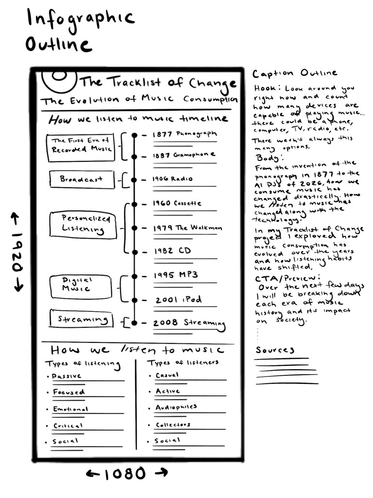
For the second section: How we listen to music, I continued the line from the timeline to split the bottom section into two lists: types of listening and listeners.
Carousel Images
For the first carousel outline for the first four eras, I created a template of 4 images:
- Introduction to the era that will include name, year, and a brief description
- Innovation image that will give background information such as year, inventor, and how it works
- An image describing the social impact of the innovation
- References image
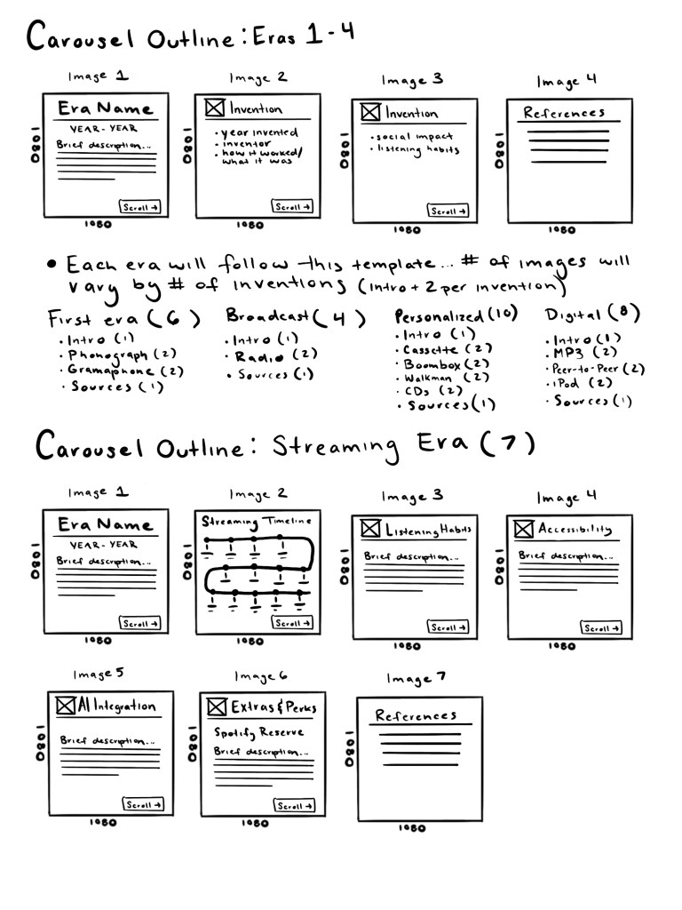
The streaming era outline is different because it focuses primarily on the impacts of music streaming platforms rather than specific innovations. After a brief era description, the specific platforms will be called out in image 2 with the timeline graphic. Then the effects on listening habits, accessibility, AI integration, and perks will follow. Ending with the references image, which is consistent with the other posts.

