
I’ve created a project plan, I’ve done the research, I’ve created outlines, and now it is time to turn my thoughts into content.
Over the past few weeks, I’ve had a clear idea of what I want my content to look like, how I will organize it, and the best solutions for my problems. In a blog by IDEO U, they point out that during this process designers “may even discover more ideas that you hadn’t thought of before” (IDEO U).
Once I started organizing the information and the assets I wanted to include, it was clear that my designs were going to deviate from my outlines a bit, which is completely normal. Those outlines were not meant to be the final versions. In creative processes, projects and plans fluctuate constantly. The purpose of those outlines was to be exactly that… a guide and a prep stage before the actual design development begins.
Rikke Friis Dam’s article on the design thinking process outlines how during the development, or prototyping, process, solutions are “investigated and then accepted, improved or rejected based on the users’ experiences” (Dam).
My Development Process
In this development stage, I was focused on full execution of all 6 of my posts for my content campaign:
- Infographic
- First Era of Recorded Music
- Broadcast Era
- Personalized Listening Era
- Digital Music Era
- Streaming Era
My process for each of the posts was similar:
- Write out copy in a document for each image in the post and caption
- Gather assets for each image
- Use Photoshop to create images
- Export as JPEGs
- Create mockups of post with caption
- Create mockups of post on a phone for better visualization
Infographic
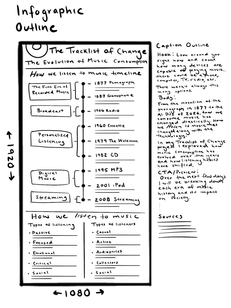
For my infographic, the designed graphic stayed consistent with the outline, with a few changes in the placement of the years in the timeline, the treatment of the headers, and the inclusion of sources at the bottom of the graphic. With the inclusion of descriptions under each innovation, I recommended moving the dates to give the copy more space. Having the years aligned vertically also makes it easier to scan the period of time the infographic includes quickly.

Carousel Images
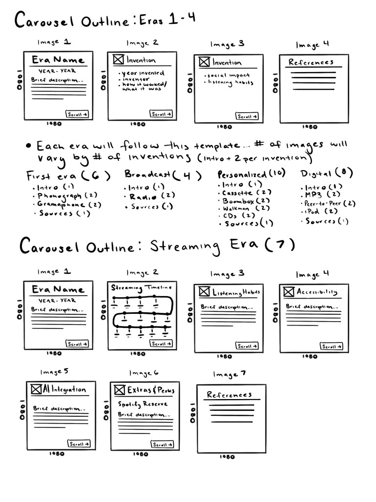
The carousel images for the individual eras are where I saw the biggest shift between outline and development. I included the same formula of title images, innovation, innovation impact, and references. However, I decided to add a summary image before the references to wrap up the era briefly.
I also opted for a bulleted copy layout, as opposed to the mainly paragraph format seen in the streaming era outline, as bullets will be easier for viewers to scan on mobile devices.
For the streaming era carousel, the order and information organization was rearranged a bit for layout and clarity purposes. Once the written content was fully developed, I changed the image order to flow more smoothly and create a story instead of fragmented bits of information.


Next Steps
The next step of my process will be to conduct user testing. The priority is to make sure my content is as clear and effective as possible.
 LAUREN SCOOPO