“A designer who doesn’t understand psychology is going to be no more successful than an architect who doesn’t understand physics” – Joe Leech
User experience (UX) design is the process of creating a user’s digital journey. By combining problem-solving and visual design, the goal is to make every step frustration-free. (Figma. n.d.)
Before designing, designers need to understand user behavior. Understanding the psychology of how users interact with a product is essential to the product’s success and usability. Aesthetics should amplify the usability, not make up for it. At first glance, a visually appealing site may seem well-designed, but if it isn’t usable, what’s the point?
“One analogy I came up with is that a beautiful, but not usable website or app is like a nice car with no engine: at first glance, it might look cool and fast, but if it doesn’t perform its function, it has no value (well, except for museum or other types of collectors).” – (Szerovay, 2022)
How does this work?
Don Norman claims that the two most important characteristics are:
- Discoverability – Is it possible to even figure out what actions are possible and where and how to perform them?
- Understanding – What does it all mean? How is the product supposed to be used? What do all the different controls and settings mean?
(Norman, 2013)
Discoverability is made up of the successful use of five fundamental psychological concepts:
- Affordances – what actions are possible
- Signifiers – communicates how to use the design and complete an action
- Constraints – boundaries of a design to limit actions
- Mappings – relationship between sets of things, such as grouping, proximity, and spatial correspondence
- Feedback – how the system communicates the results of an action, and they are working on a user’s request
(Norman, 2013)
All of these elements aim to make a platform align with a user’s mental model, conceptual models in people’s minds made up of past experiences (Norman, 2013). These models help us understand new and novel situations (Web Conferences Amsterdam, 2019).
To see these elements in action, I analyzed two sites based on the concepts listed above.
Website 1: Liquid I.V.
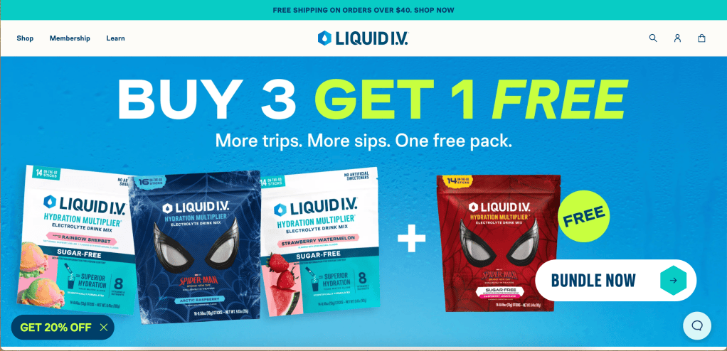
Affordances of the Liquid I.V. website include:
- Shopping for products
- Starting a membership
- Learning about the brand
The signifiers for those actions are found in the navigation, represented by simply stating:
- Shop
- Membership
- Learn

These three affordances are grouped on the left side of the navigation, matching most users’ mental models of e-commerce websites. Purchasing products and learning about a brand are the user’s ultimate goals, and in the common reading process, we read left to right, top to bottom. Placing these actions in this section is an example of mapping aligning with a mental model.
With each selection or hover, the button or header changes color to communicate that the user’s action has been received.
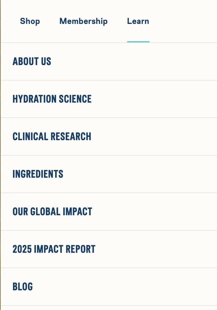
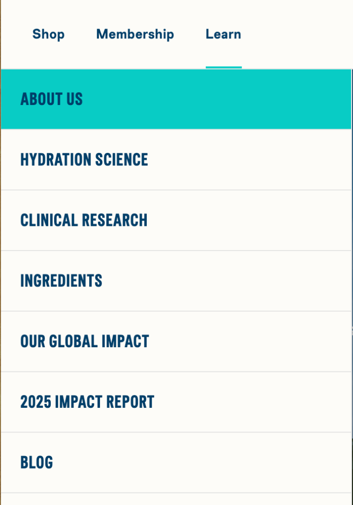
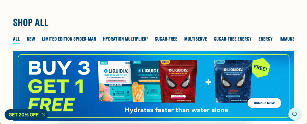
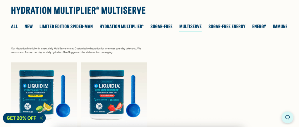
To assess the UX of Liquid I.V.’s site, I completed a task: purchasing a product. By selecting the shop link in the navigation, I was taken to a tab that groups products by category and received immediate feedback as I clicked through the categories: the product collections changed, and the category name was underlined in blue.
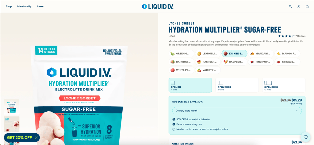
After selecting a product, the website shows customizable purchasing options. All flavors are listed above, allowing me to change my options easily. The selected flavors are highlighted to show me what I have chosen. The next options are mapped in a procedural system with options for quantity, payment options, and finally adding to cart. Signifiers represent all actions and support a clear, easy product-purchasing experience.
For more task examples, view the full website analysis doc linked at the bottom of the page.
Website 2: Lovesac
The second website, Lovesac, is an example of a site with a more difficult experience because of how much information it includes and how it is mapped.
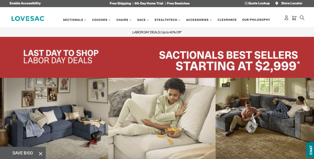
On the homepage, some affordances available are:
- Shopping by product category
- Learning about the brand
- Locating a store
Signifiers in the navigation bar and header banner represent these affordances. All categories are listed in the navigation for the user to choose from, and the “Our Philosophy” and “Store Locator” tabs are present on the top right of the screen. Placing the educational tabs in that location aligns with the mental model of searching. Search options are typically found in the top-right corner of sites, so placing these two signifiers there benefits the user.

With each click, a new menu opened, or the selection was underlined to communicate that the system received the user’s action.

To assess the site’s mapping and feedback, I completed a task: shopping for a product. The first step I took was selecting the “Sectionals” tab and choosing the “Sactionals” link under the Shop Sectionals submenu.
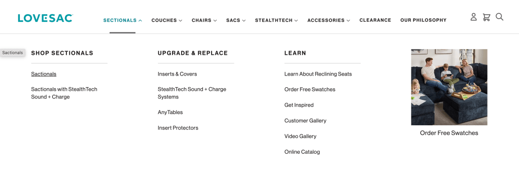
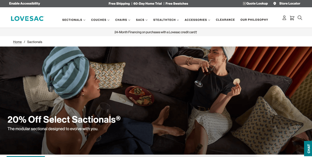
This is where the site’s mapping differed from my mental model because instead of seeing products immediately, I saw a large image promoting a discount, and underneath it was another menu with a shop button and various product qualities.
On this page, there were no direct options to add a product to my cart. The mapping in this section is misleading: I chose the “Shop Sactionals” tab but couldn’t see specific products.
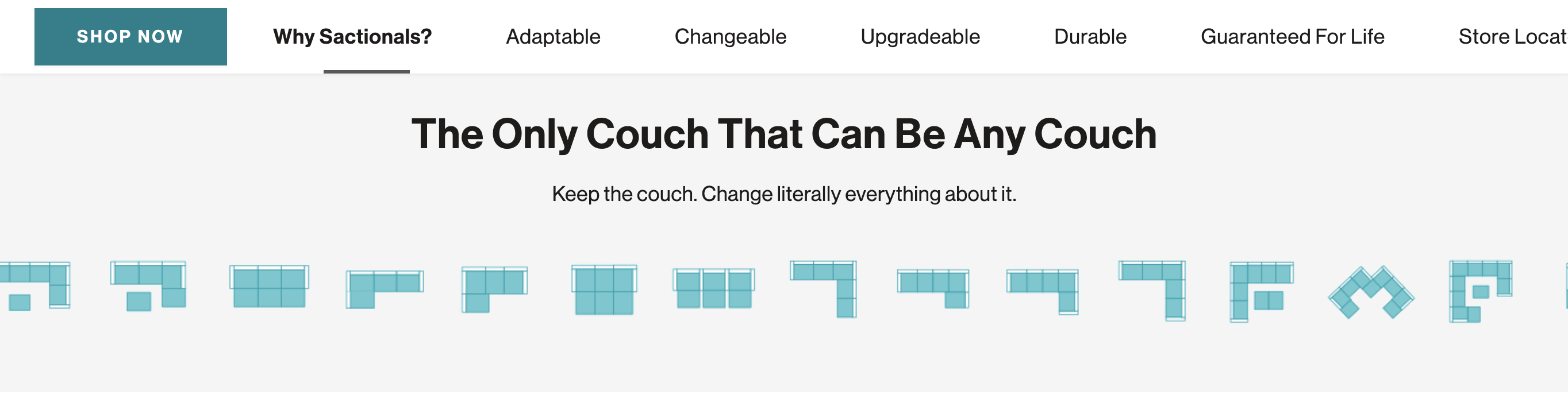
After selecting the “Shop Now” button on the page, you’re taken to a page where you can add products to the cart. Once on this page, the mapping and feedback mechanisms work well for the user. Getting to this page took a few too many tabs, which decreases shoppability.
For more task examples, view the full website analysis doc linked at the bottom of the page.
Conclusion
No website or design is always perfect; there is always room for improvement. As society evolves, our mental models evolve with us. Frequent check-ins on a site’s usability, as we did here, help us, as designers, ensure we give users the best experience possible.
Full website analysis doc:
Resources
Liquid IV. (n.d.-a). Liquid-Iv.Com. Retrieved August 30, 2026, from https://www.liquid-iv.com/
Lovesac. (n.d.-b). Www.Lovesac.Com. Retrieved August 30, 2026, from https://www.lovesac.com/
Norman, D. (2013). The Design of Everyday Things. Basic Books. (Original work published 1988)

