
Do you know how people say there are 5 stages of grief? Denial, bargaining, anger, depression, and acceptance (Cleveland Clinic, 2025).
What if I told you there are 3 levels (stages) of processing information? Some occur on the conscious level, but the majority are subconscious. When we’re prompted by an image, a digital interface, or even a sign on the street, our brains go through a series of steps to process information and eventually form opinions and emotions. This psychological process is important for designers to understand.
“Why do we need to know about the human mind? Because things are designed to be used by people, and without a deep understanding of people, the designs are apt to be faulty, difficult to use, difficult to understand” (Norman, 2013)
In his book, The Design of Everyday Things, Don Norman notes that cognition and emotion cannot be separated as “cognitive thoughts lead to emotions: emotions drive cognitive thoughts” (Norman, 2013) In this relationship cognition makes sense of the world and emotion assigns value to process everyday occurrences (Norman, 2013).
Norman breaks down the processing experience into three levels:
- The visceral level – subconscious thoughts about immediate perception on the appearance level: sight, sound, smell, touch, etc.
- The behavioral level – subconscious assessment of how learned skills and expectations compare to the product, resulting in satisfaction or frustration
- The reflective level – conscious reflection with deep thought about the experience overall
To dive deeper into this topic, I analyzed two websites with differing objectives to see these levels at work:
Crayola: A brand that sells art supplies such as crayons, markers, colored pencils, and more. Crayola focuses on creating an environment where users can be creative and dive into their imagination.

ASPCA (American Society for the Prevention of Cruelty to Animals): A non-profit organization focused on fighting animal cruelty, while rescuing and securing adoptions for animals in need.
It’s what’s on the inside that counts… in this case, it’s not
The first level Don Norman outlined is the Visceral Level. When we first view a website, our brains immediately start forming feelings based on appearances alone. This level is “responsible for the ingrained, automatic and almost animalistic qualities of human emotion, which are almost entirely out of our control” (Komninos, 2026). Design elements such as color, typography, and images make up a brand’s visual identity.
Crayola – The Visceral Level
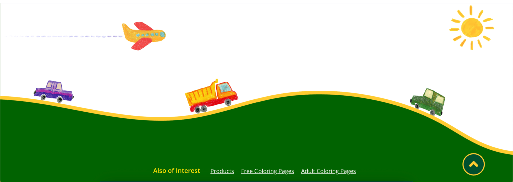
When viewing the Crayola site, users are immediately drawn to the organized interface, calming colors, and eye-catching hand-drawn doodles. The interface feels warm and inviting, and it motivates you to create
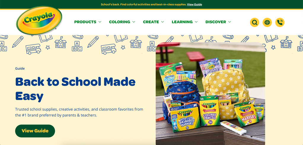
The color palette chosen embodies the Crayola brand with colors that promote positivity, growth, and wholesomeness. In psychology, each color represents an emotion; even subconsciously, seeing a certain color evokes a standard range of emotions.
The core colors in Crayola’s branding evoke:
- Green – calm, clean, growth
- Yellow – happiness
- Cream – comfort
- White – wholesome
The typography throughout the site combines a rounded sans-serif typeface that reflects the creative message in the headers with a simple sans-serif typeface for the body copy. Using a simple body typeface ensures the copy is readable at all sizes for a frustration-free reading experience.
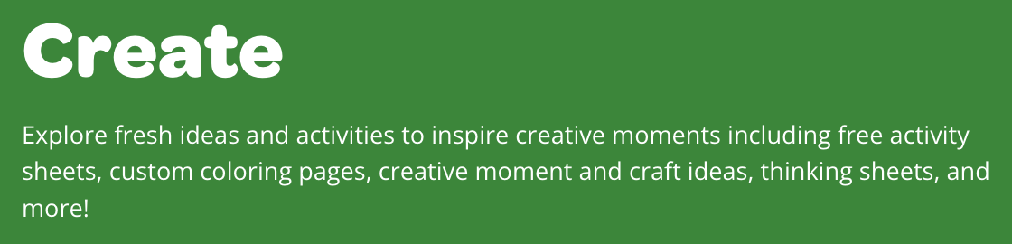
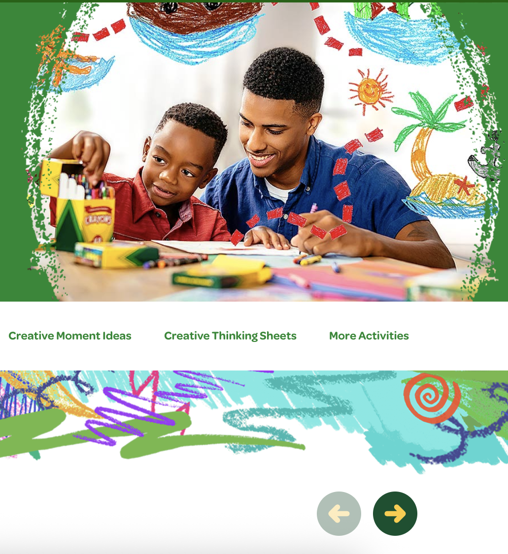
Crayola uses a mix of lifestyle images and hand-drawn graphics throughout its site to emphasize creativity and playfulness. Images such as the father and son motivate users to create something with their loved ones.
ASPCA – The Visceral Level
Now, in a completely different tone, the ASPCA website immediately evokes emotions such as sadness, empathy, and motivation to support its cause. Since the organization deals with a serious topic- rescuing animals and protecting them from cruelty- the interface does not rely on flashy graphics or “fun” elements to engage users.
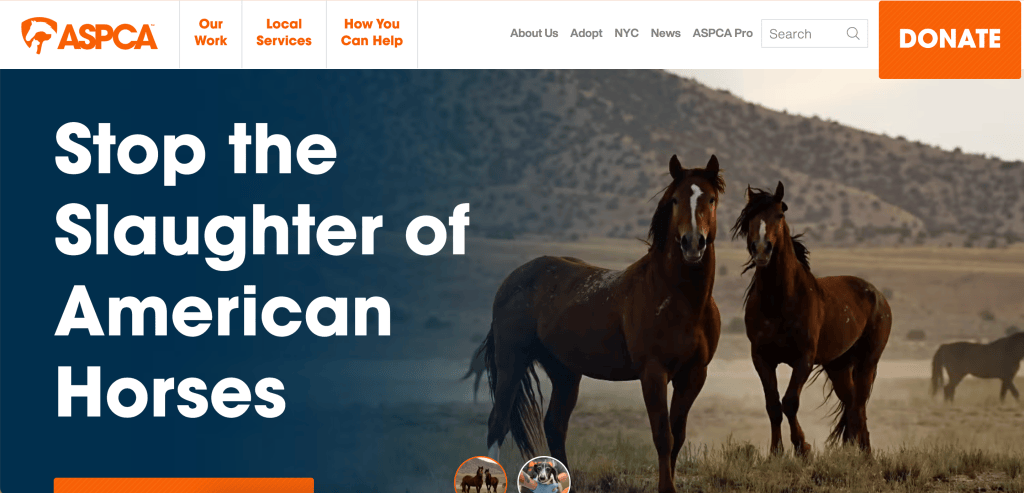
The ASPCA color palette consists of four colors that align with the organization’s desire for change and establish it as trustworthy:
- Orange – warm and optimistic
- Navy Blue – sadness, corporate, seriousness, trustworthy
- Cream – comfort
- White – wholesome
The orange, cream, and white tones convey optimism that a donation can help address this issue. White and cream could also represent the purity of the animals in need of help. Blue adds a serious tone to the site and supports the organization’s credibility.
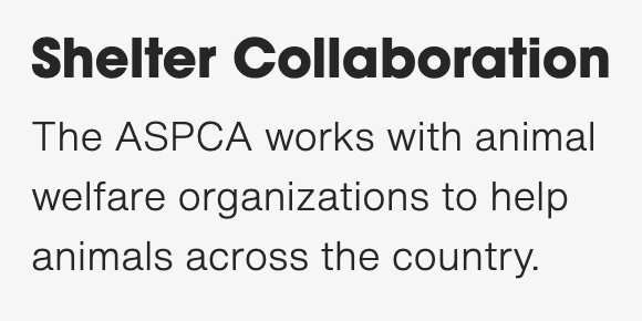
The typography throughout the ASPCA site uses only clean, bold sans-serifs to match the seriousness of the topic.
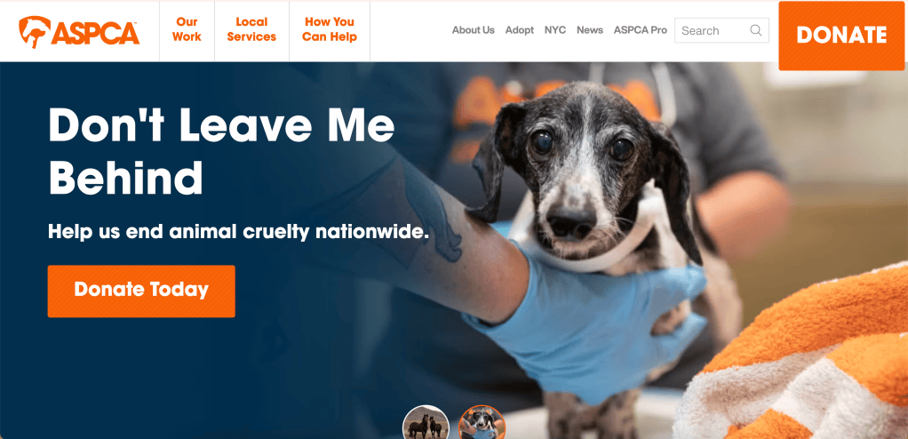
The site prioritizes images and messaging that pull on users’ heartstrings to motivate them to get involved in the cause. Seeing an image of a puppy with the copy “Don’t Leave Me Behind” definitely encourages me to donate.
Does this thing work?
When we repeat activities, our brains form mental models. A mental model is the system we create that helps us predict how a system will work and directly influences how we interact with the world around us (Chan, 2024). We base these models on past experiences to prepare for what we might see in the future. The behavioral level focuses on how we interact with the interface, and if the processes do not align, that could heavily impact a person’s emotions. We evaluate websites and products by how easily we can achieve our goal going into the experience.
This aspect of design is also referred to as usability, the practicality of a product (Komninos, 2026).
Crayola – The Behavioral Level
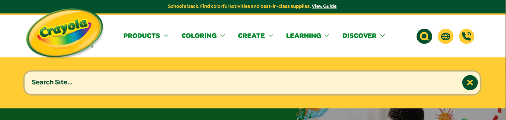
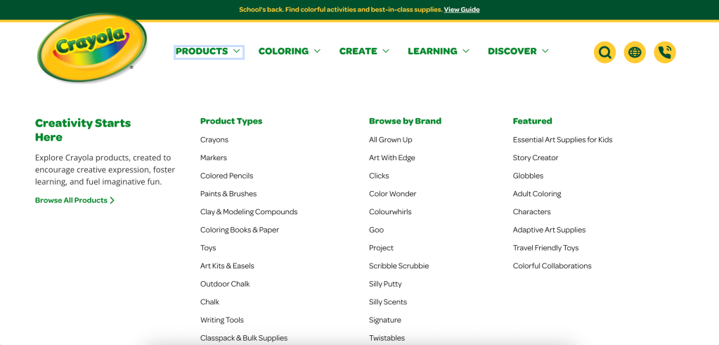
Overall, the Crayola site is highly usable. The main pages are clearly labeled in the navigation, and the site uses feedback mechanisms such as an underline effect and color changes to show that it has received the user’s request. The page offers easily accessible submenus to personalize the experience further.

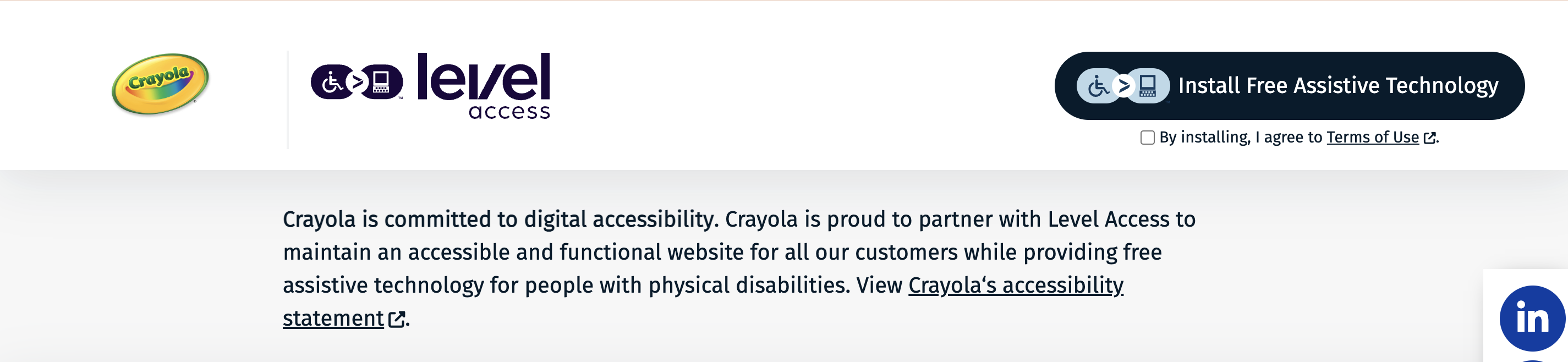
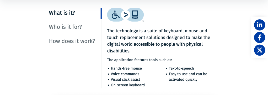
One integration that exceeded my mental model was Level Access, a free tool that helps people with physical disabilities navigate the site. This shows the Crayola team’s commitment to inclusivity and its goal of making creativity accessible to all.
However, their use of icons to represent the Level Access feature, the help center, search, and language options could confuse users. These icons don’t clearly communicate the meaning behind each action and can lead to user frustration.


ASPCA – The Behavioral Level
In terms of usability, all actions I tested on the ASPCA website were very simple to complete. Each section is clearly labeled in the top navigation by its full name, not icons. Various feedback mechanisms (underline and color changes) communicate the progress of my action. The site also provides submenus for each tab to personalize the experience further.

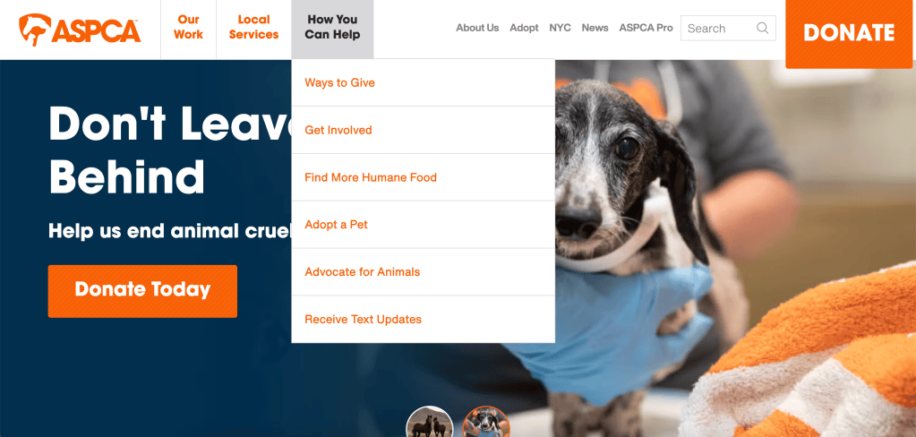
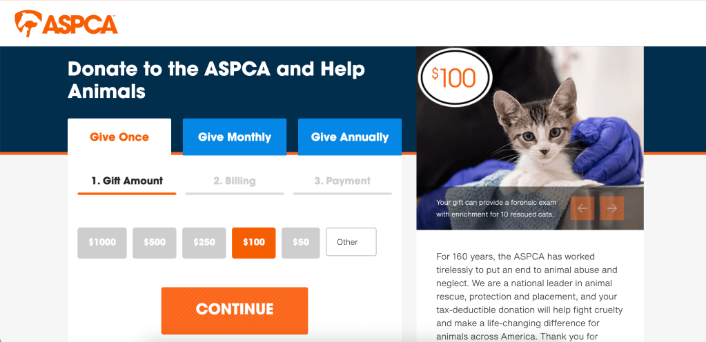
The most important action for the ASPCA website is reaching the donation tab. Throughout the site, multiple buttons and links direct users to the donation tab. The main one in the navigation is larger than the other menu elements, emphasizing the action and ensuring readability. Once on the Donate tab, users can easily understand their options. Large headers, buttons, and colors guide the steps and indicate which selections are being recorded.
How did this make me feel?
The third level of processing is the reflective level. This is where a user “considers the rationalization and intellectualization of a product. Can I tell a story about it? Does it appeal to my self-image, to my pride?” (Komninos, 2026). This is the overall conclusion of the product experience. A reflection of questions such as…
- Did I enjoy that experience?
- Would I return to this site again?
- Would I recommend it to others?
Crayola and the ASPCA – The Reflective Level
While these two organizations have different goals, both sites provide a user experience that I believe positively impacts their relationship with users
Crayola communicates that the brand focuses on the consumer experience, creativity, and imagination. It emphasizes what users can create while offering opportunities to purchase supplies and explore craft ideas. Throughout the site, it emphasizes connecting with users and helping them connect. It is also inclusive of people with disabilities and those who speak different languages by offering options to customize the experience. By combining a unique visual identity, strong usability, and platform context, the site provides an experience users want to return to and supports a long-term, trusted relationship.
The ASPCA website uses design elements to help users feel empathy for the cause and trust the professional-looking organization. The site is usable, with all actions completable and clear feedback throughout each process. Users will likely return to the site if they are passionate about the issue and refer others to it as well. The navigation and UX design make it easy for users to make a positive impact on a topic as serious as protecting animals.
Full website analysis doc:
Resources
ASPCA. (n.d.). ASPCA. ASPCA. Aspca. Retrieved September 3, 2026, from https://www.aspca.org
Crayola. (n.d.). Crayola.Com. Retrieved September 3, 2026, from https://www.crayola.com/
Norman, D. (2013). The Design of Everyday Things. Basic Books. (Original work published 1988)

